A search design for every state.
JioSaavn – Live Search
Firstpost
pocketnow.com
Blog Post
The live search page utilizes every possible state of the user’s search journey, helping them as best as possible along the way.
Role
Design Conception & Lead
Working closely with leadership, product and engineering teams to lead the design of an immersive search experience, complete with AI driven recommendations, and multiple UI states depending on the users’ actions.
Mission
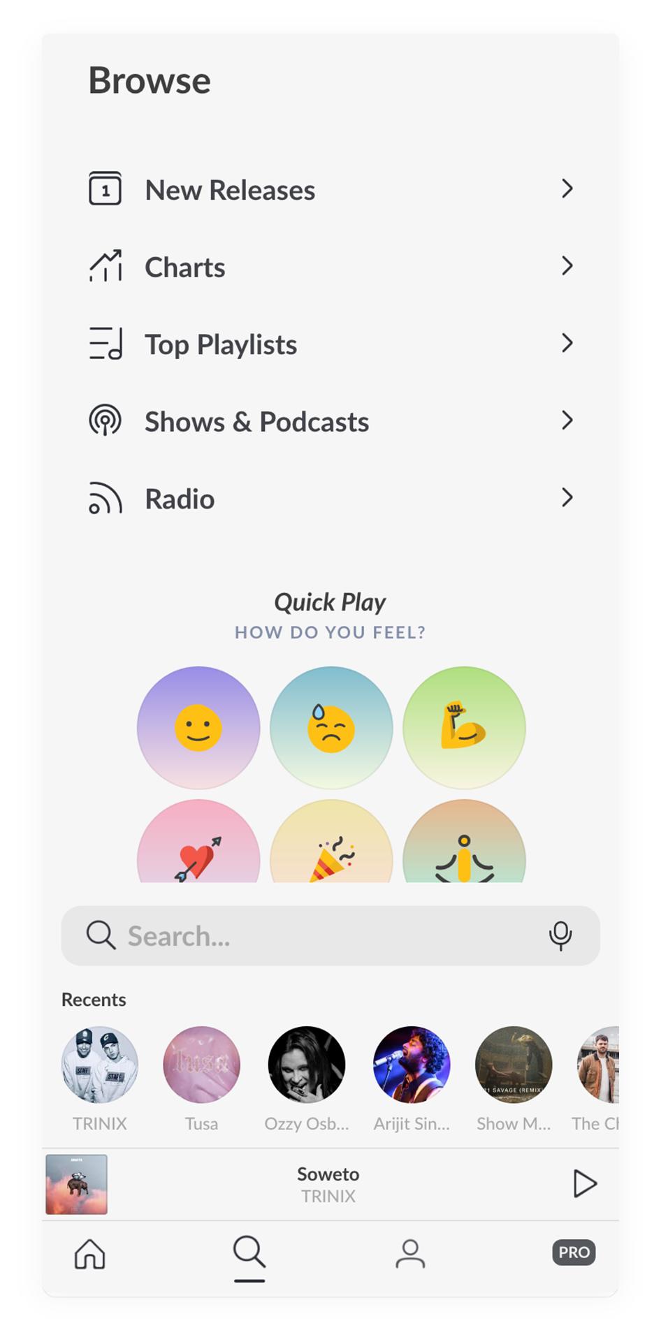
Explore & Discover
Why does a user visit the search page? We start there. They are there for one of two reasons:
- They know what they’re looking for, and didn't find it on the home page.
- They don’t know what they’re looking for, and didn’t find it on the home page.
The former is an easy problem to solve. Give the user a search bar, with AI auto-complete and categorized results. Kid stuff.
But what if that’s not enough? Why not take the opportunity to throw the user into an immersive, visually appealing recommendation experience?
Initial Landing Concept
Initial Tapped Concept
Approach
The Meat & Potatoes
We started with some initial concepts that explored the idea of using search as a browsable page. Giving the user quick categorization options from the landing page, and a display grid on the tapped state. Through rounds of feedback and adjustments, we arrived at what would be the finalized design we wanted to test with.
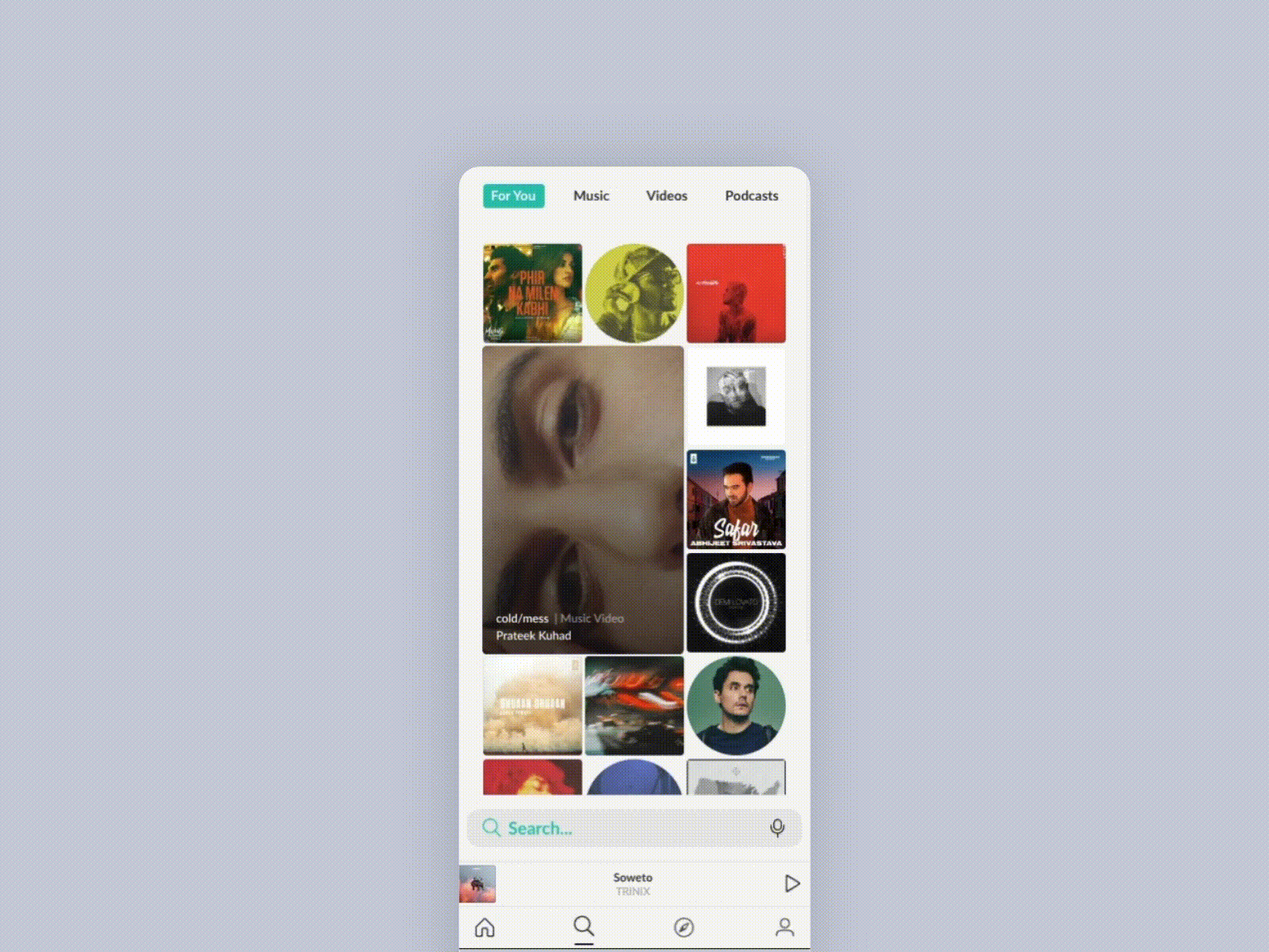
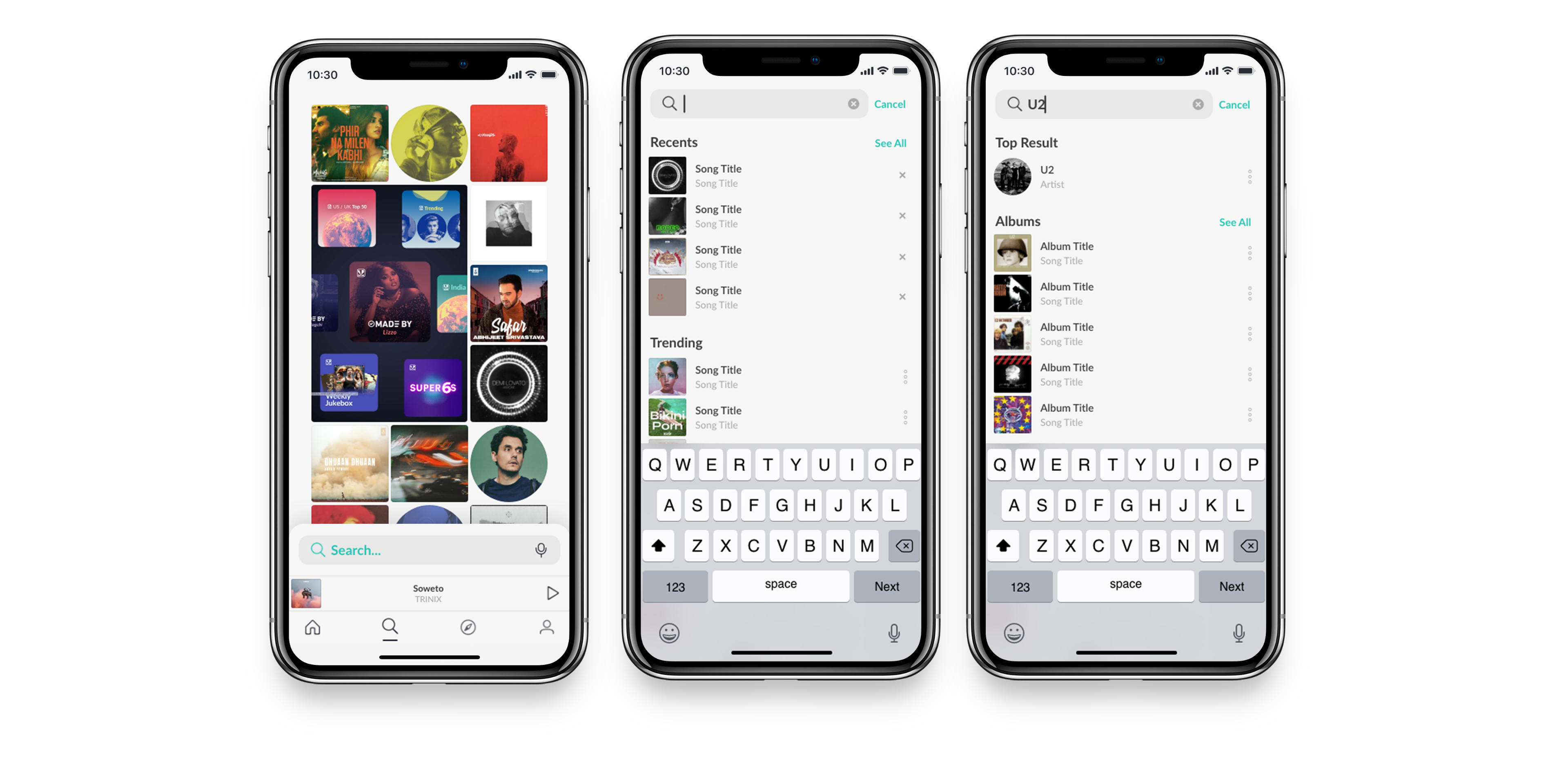
The redesign of the search experience includes three states of the search page.
- Search Landing
- Search Tapped
- Search Results
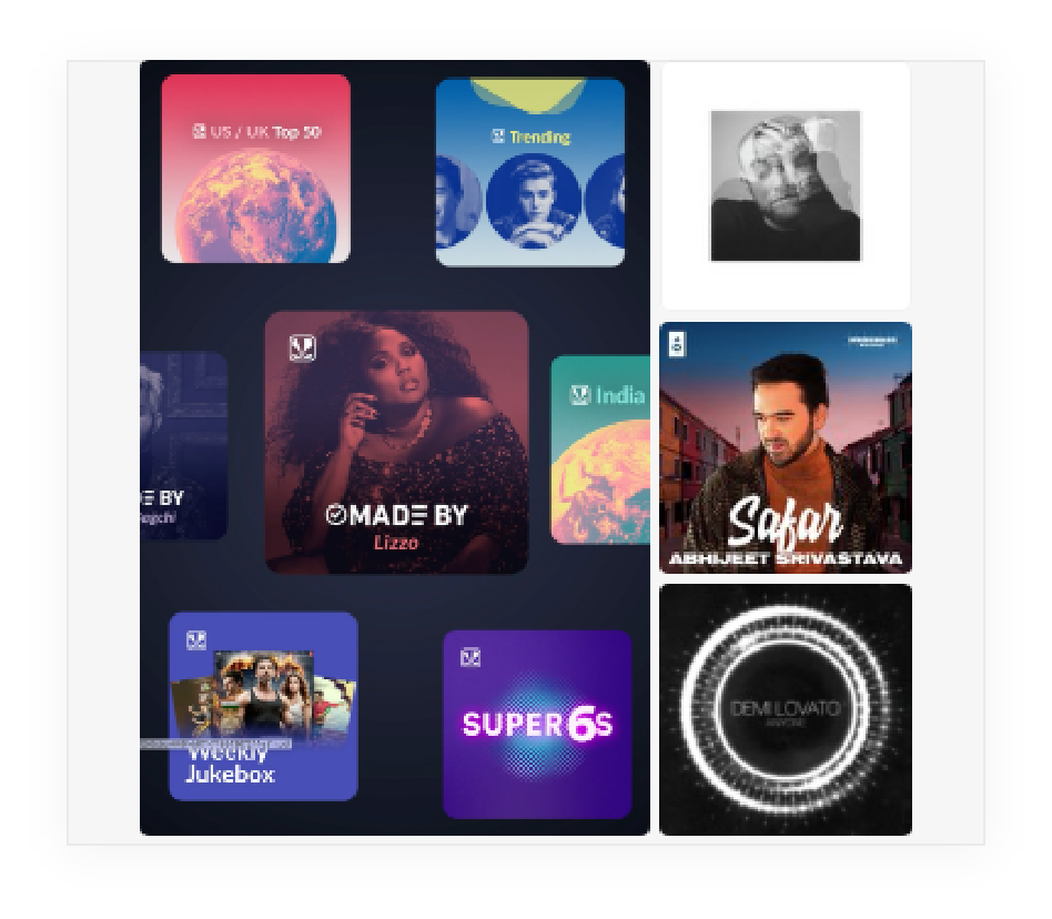
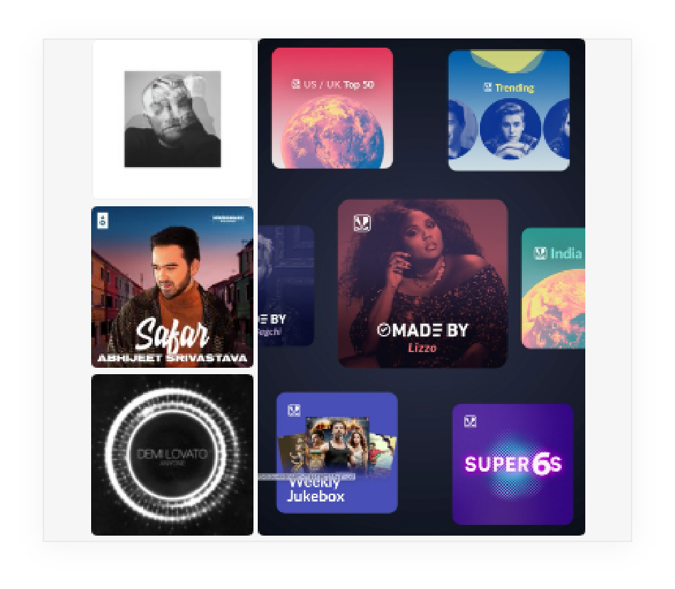
The landing state is the default state when the search tab is opened. It includes a discovery grid of artwork and videos based on trending and recommended content, and the search bar, which is placed at the bottom of the screen, making it much easier to reach with your thumb.
The UI (coined “discovery grid"), on the search landing page was designed to modularly allow for 5 row types, consisting of standard and “featured” tiles, which have rules and guidelines respective to the row and tile type. The row types include:
- STANDARD 1:1 Row
- FEATURED 2:2 Left Row
- FEATURED 2:2 Right Row
- FEATURED 2:3 Left Row
- FEATURED 2:3 Right Row

1:1 Row

2:2 Left Row

2:2 Right Row
2:3 Left Row
2:3 Right Row
Learnings
Results & Hypotheses
This project has been a huge learning opportunity. Data showed that the number of searches and searches per user with the release of the new search UI went down initially, highlighting a front end bug. Once this was resolved, numbers increased.
After running a few light experiments, the numbers increased more, but not to the levels we’d hoped for.
We hypothesize that the grid’s recommendation algorithm isn’t as intelligent as it needs to be for the numbers to grow, and that despite the effort from a UI/UX side, the engineering effort required just wasn’t there.
In addition, in effort to release the new design as quickly as possible, we withheld any organizational categorization of the search grid (omitted the category tabs at the top of the page), which likely made the grid unusable for most users.
Next steps were to reevaluate search and what a user needs when it comes to searching for content. We turned to an onboarding project with simplified search, right on the home page, and are in the process of testing and designing the next variants to reach our goals.
Credits
3 Teams,
Countless Contributers
Design Lead:
Leeann Sheely
Product Lead:
Clint Balcom
Engineering Lead:
Ramesh Sudini