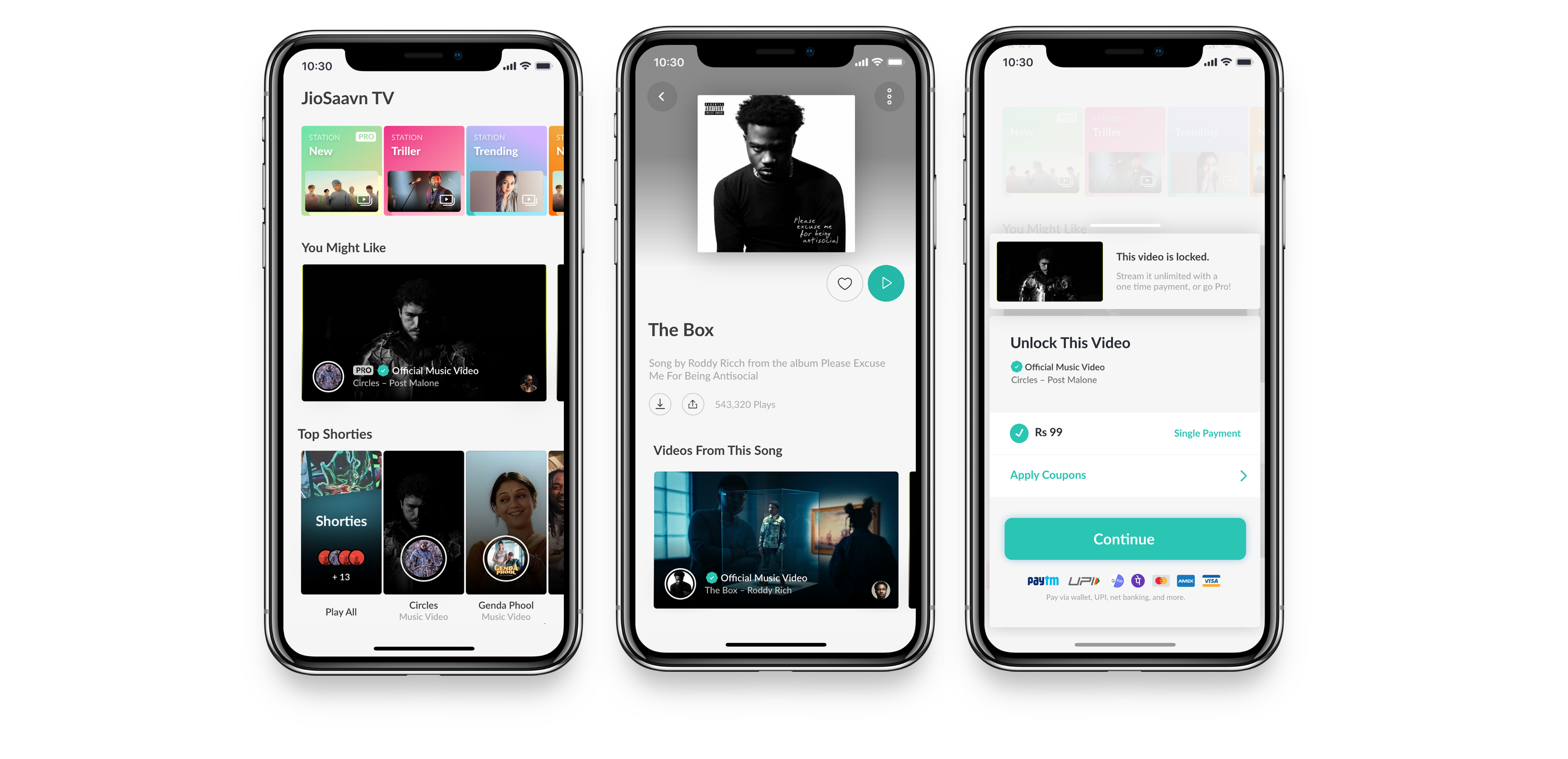
–– JioSaavnTV
Info
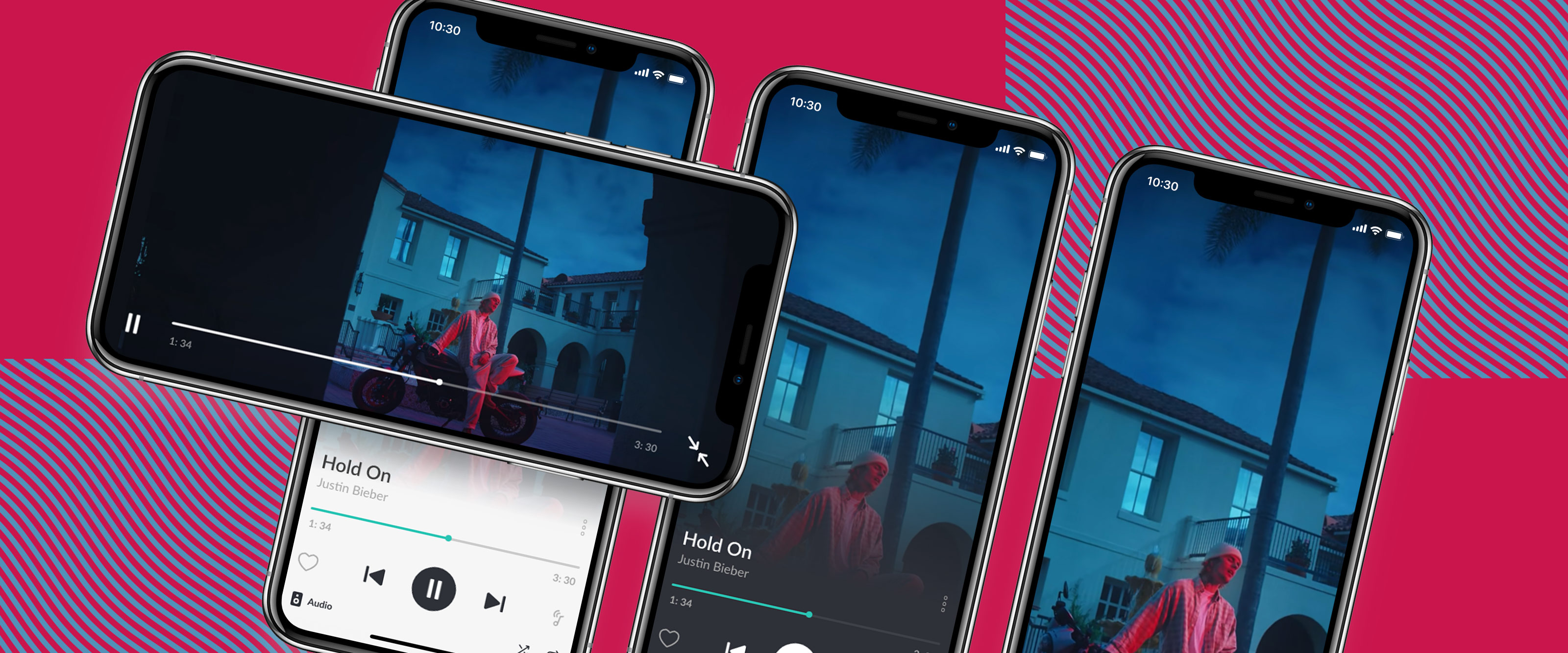
JioSaavn TV – Video Player
billboard.com
businessinsider.com
musically.com
Role ҉ VP of Design
Company ҉ JioSaavn
JioSaavn2021NYC
Overview
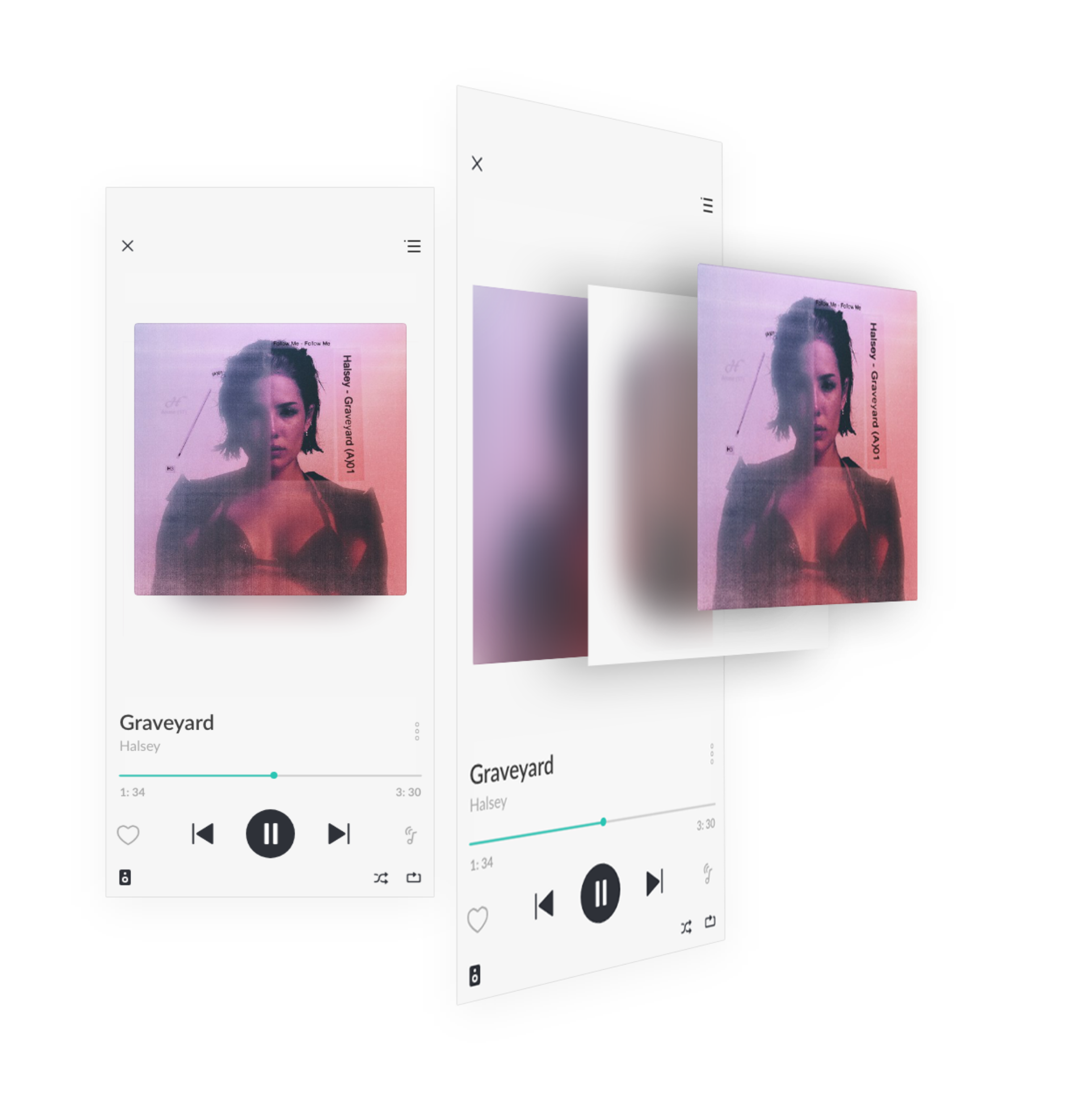
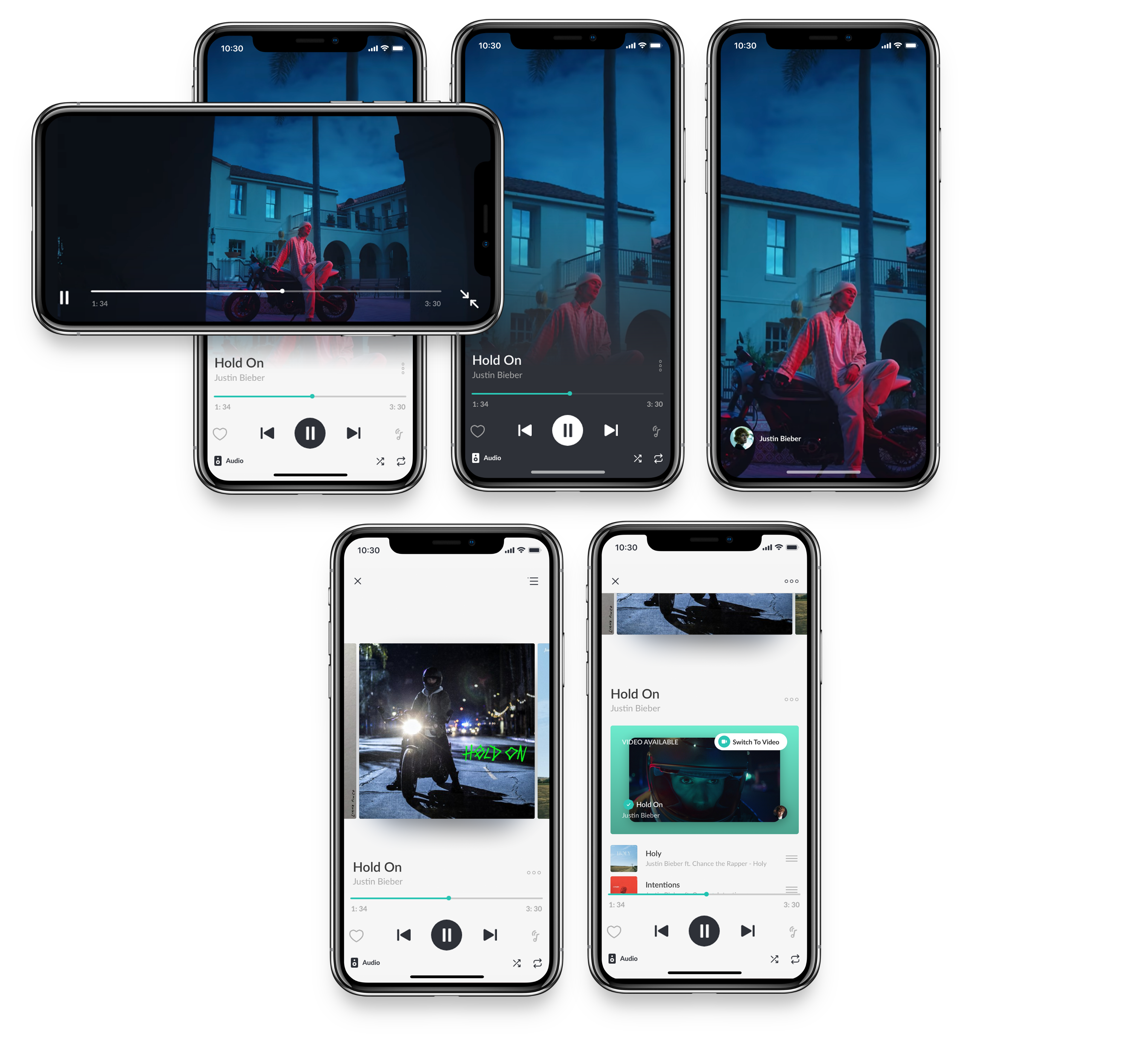
JioSaavnTV allows video and audio to seamlessly live together in one effortless experience.
Concept –– Just watch.
Know your audience and do what you do best. As soon as these focus points are lost, so is the impact.
JioSaavn does music best. Our goal was to introduce an even more engaging music experience to our power users (specifically Pro users) that:
- Doesn’t sacrifice usability
- Increases delight
- Increases the Pro product value
Working alongside the leadership, product and engineering teams I lead the design of the JioSaavnTV platform.

Before Redesign

After Redesign
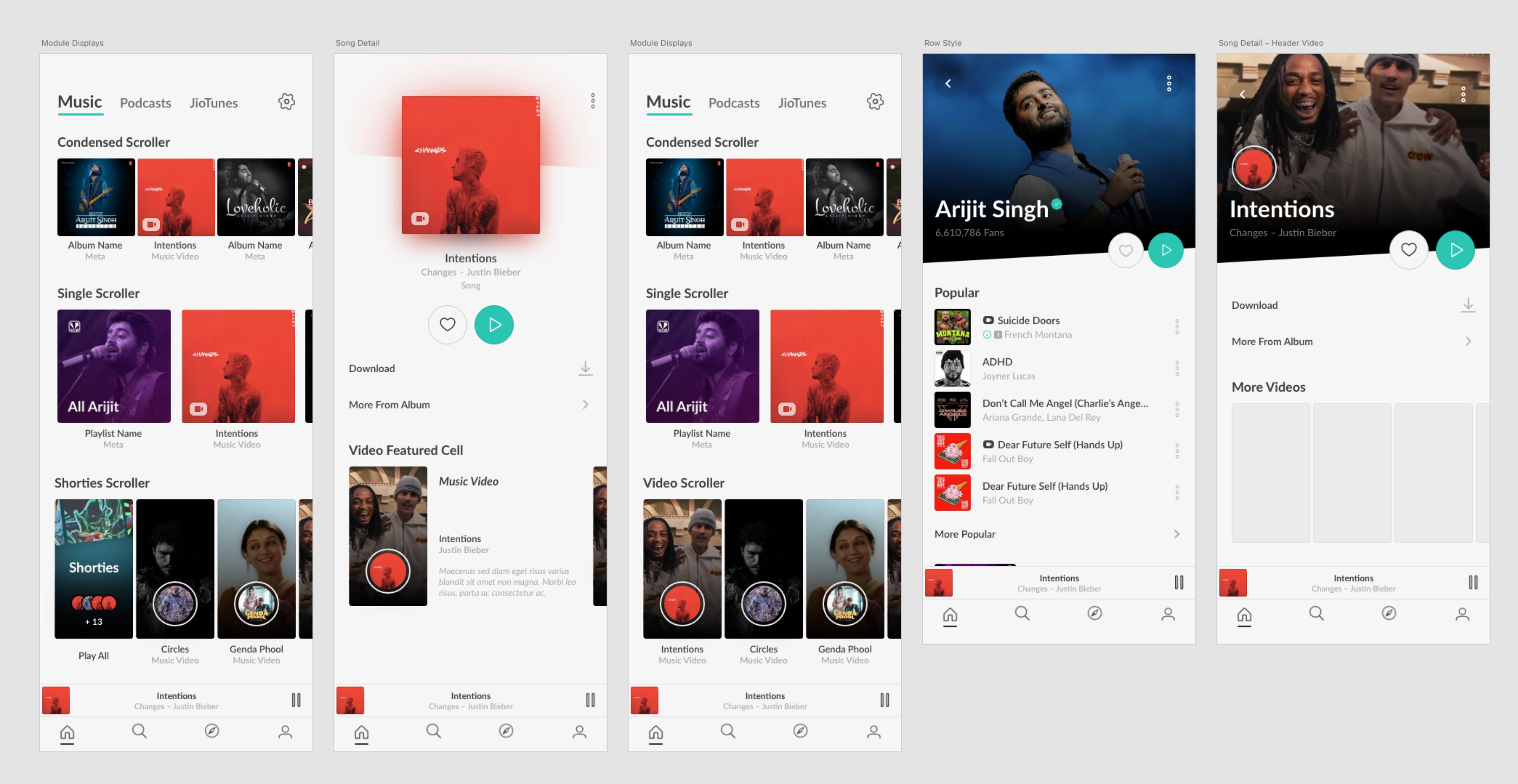
Approach –– More but less.
The first stage was redesigning the player (above) in a way that could seamlessly facilitate video. The JioSaavn player was already unique in that the “now playing” view and queue are rolled into one fluid page. We had to figure out how to add more (support for video, lyrics, and some kind of callout for various purposes), but make it feel like less.
The redesigned player seamlessly displays album artwork, looping visuals, or full videos in dark or light mode, all based on the content—no mode-switching or extra gestures needed. Simplicity was a challenge worth solving.