JioSaavn home page experiments.
JioSaavn – Home Page
Prototypes
At JioSaavn, the product design process is simple. Get it live, collect data, make it better. Repeat. Initiate with intuition, and fine-tune with data.
Role
Director
Often times, projects don’t really have a hard beginning or end. They are ongoing experiments with incremental improvements, increasing engagement and retention (among other goals) over time. This is a peek into the ongoing project of experiments on the home page of JioSaavn to solve for low cold start numbers.
Audience & Mission
Aquisition & Retention
Our data showed us that some subset of newly acquired users were getting to the home page of the app, but not engaging (playing content) in the app, then dropping off. We wanted to launch several experiments exploring solutions for these problems, to ultimately optimize engagement short-term, and retention long-term.
Experiments
The Meat & Potatoes
Our onboarding process had been through many testing rounds of login walls with and without persona identifiers and we found we had the least drop-off, and highest engagement, when there was a delayed login wall. That is, the user would be dropped almost immediately onto the home page from app install. However, this meant we didn’t have any data on the user, and couldn’t provide unique recommendations at the onset of acquisition. This onboarding test ensured users were still making it to their home page frictionlessly, while providing a seamless onboarding experience to recommendations that would be easy to locate while being totally dismissible. This test proved to be a non-disruptive addition to the app experience, with fewer cold-start numbers 1:1 when compared to the same experience without it.
We added a test for single tap play unique to new users who had not yet played any content. This experiment included two variants, one where tapping content tiles automatically played content, with a separate icon to open the content details, and another where tapping the content tile opened content details, and a separate icon immediately played content. Both of these tests facilitated single tap playing content, with the unique variable being the touchpoint.
Additionally, we added a nudge test to the player’s recommended content. When the player is empty (as it is for new users), and a track is played, more similar tracks get automatically added to the player by default. This is a feature that can be toggled on and off directly from the player. We added a test for a subtle and more aggressive nudge to open the player queue to onboard users to this feature and to the player in general.
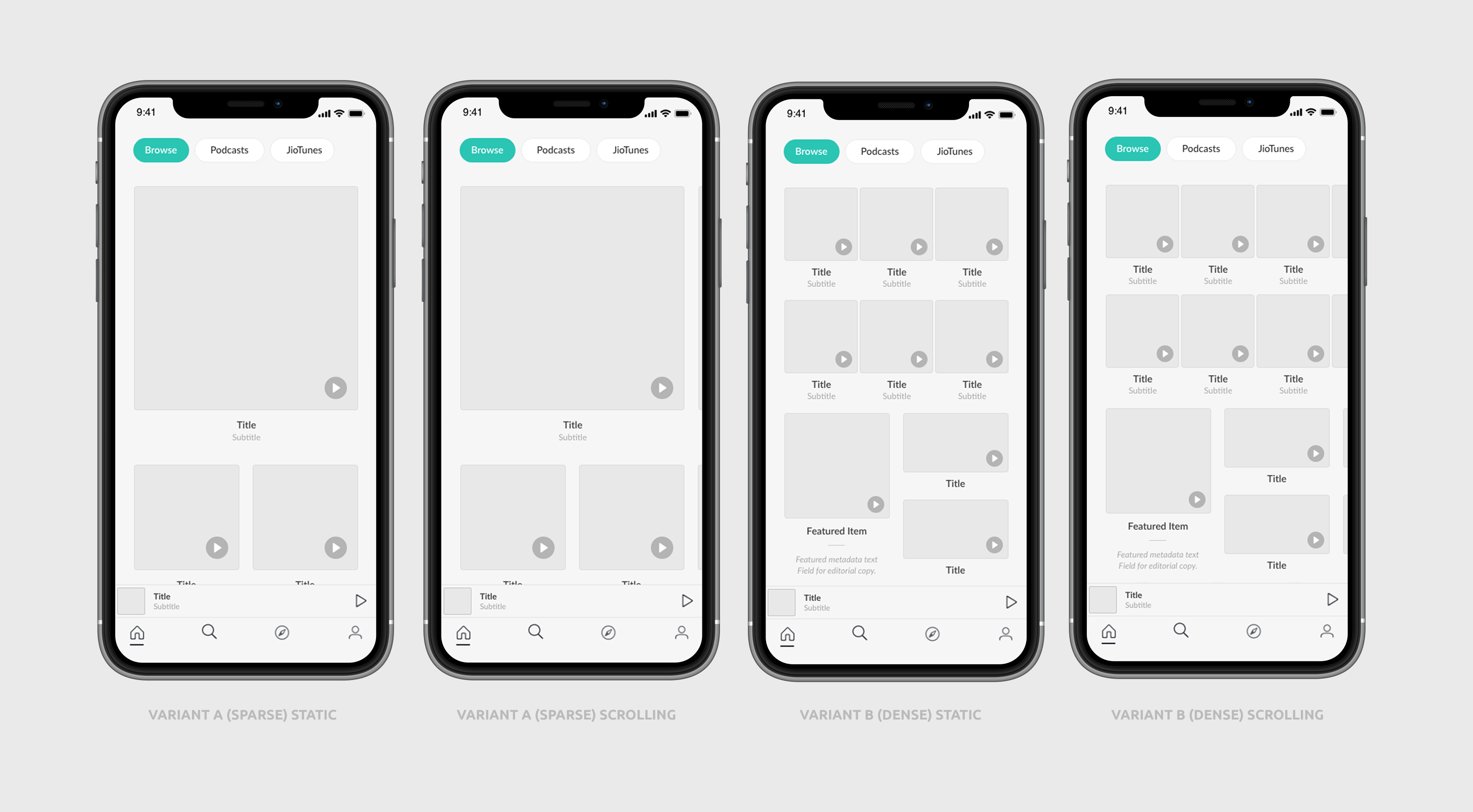
One test we experimented with was the size and density of content displayed on the home page. Below you’ll see some of the several variants we tested against each other. The question being whether larger or smaller tiles would lead to more first time streaming. Some of the variants include horizontal scrollers while some only allow vertical scrolling, minimizing the number of possible actions the user can take. We also experimented with displaying subtitles vs. only the content title.
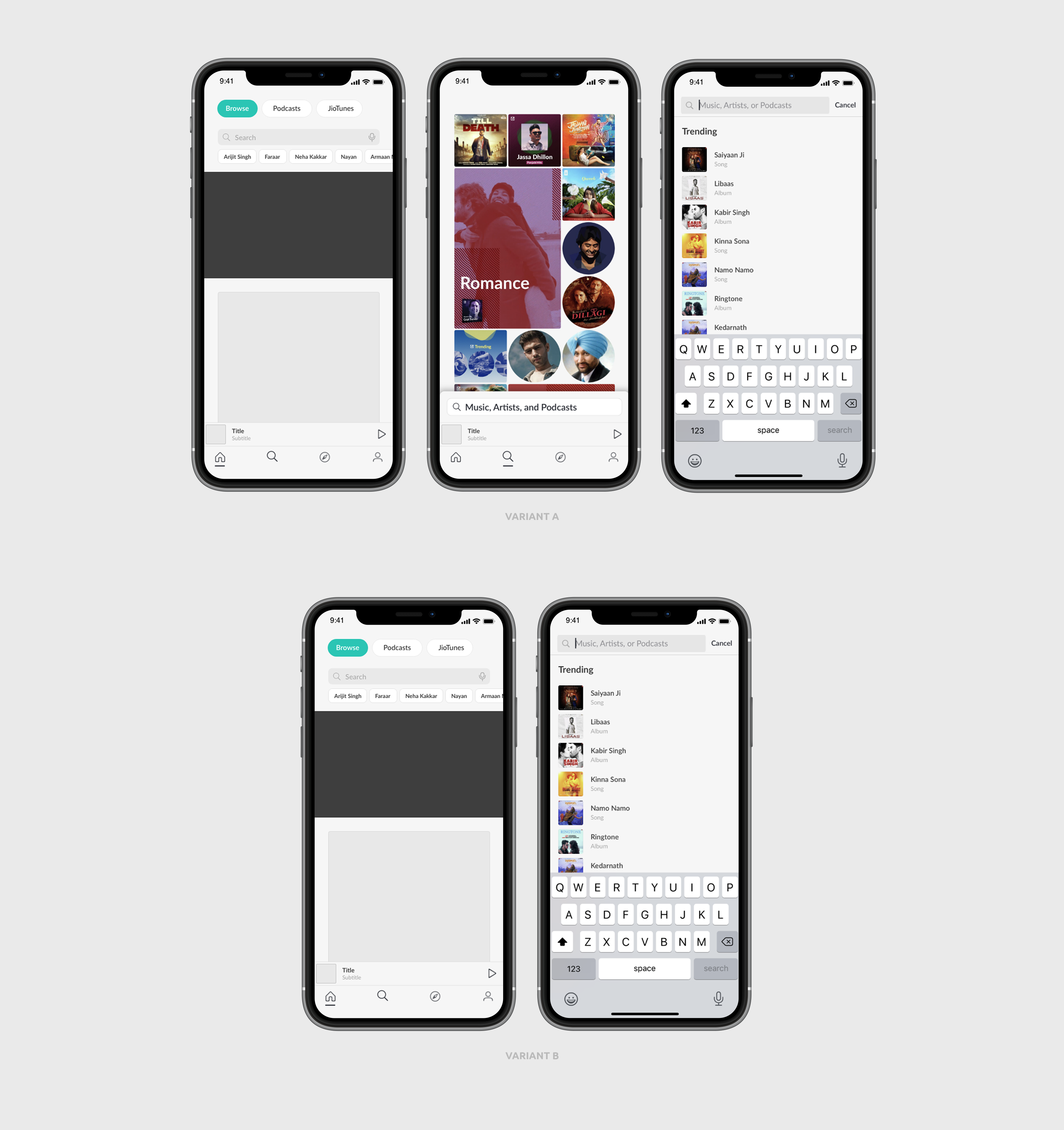
Another test we implemented was elevating search’s visibility by putting a search bar directly at the top of the home page. One variant opened a auto-complete search result flow directly over the home page, while the other opened the search page from the initial tap. We weighed the pros and cons to introducing the search page vs. providing specific content quicker, and wanted to see if either was better for long-term retention.
The overarching theme to all of these experiments is that you don’t really know what’s going to work until you test it. Sometimes, the smallest variations make a huge difference, and sometimes they don’t. These are the steps towards fine-tuning a great design into achieving great results.
Credits
4 Teams
Countless Contributers
Design Direction:
Leeann Sheely
Product Lead:
Clint Balcom
Engineering Lead:
Ramesh Sudini
Product Designer:
Fahm Sikder